How might a HarmonyOS lockscreen become a tiny world instead of a static wallpaper?
HUAWEI HarmonyOS Theme
HUAWEI Meta StationWill the metaverse be the future of online network and remote work?
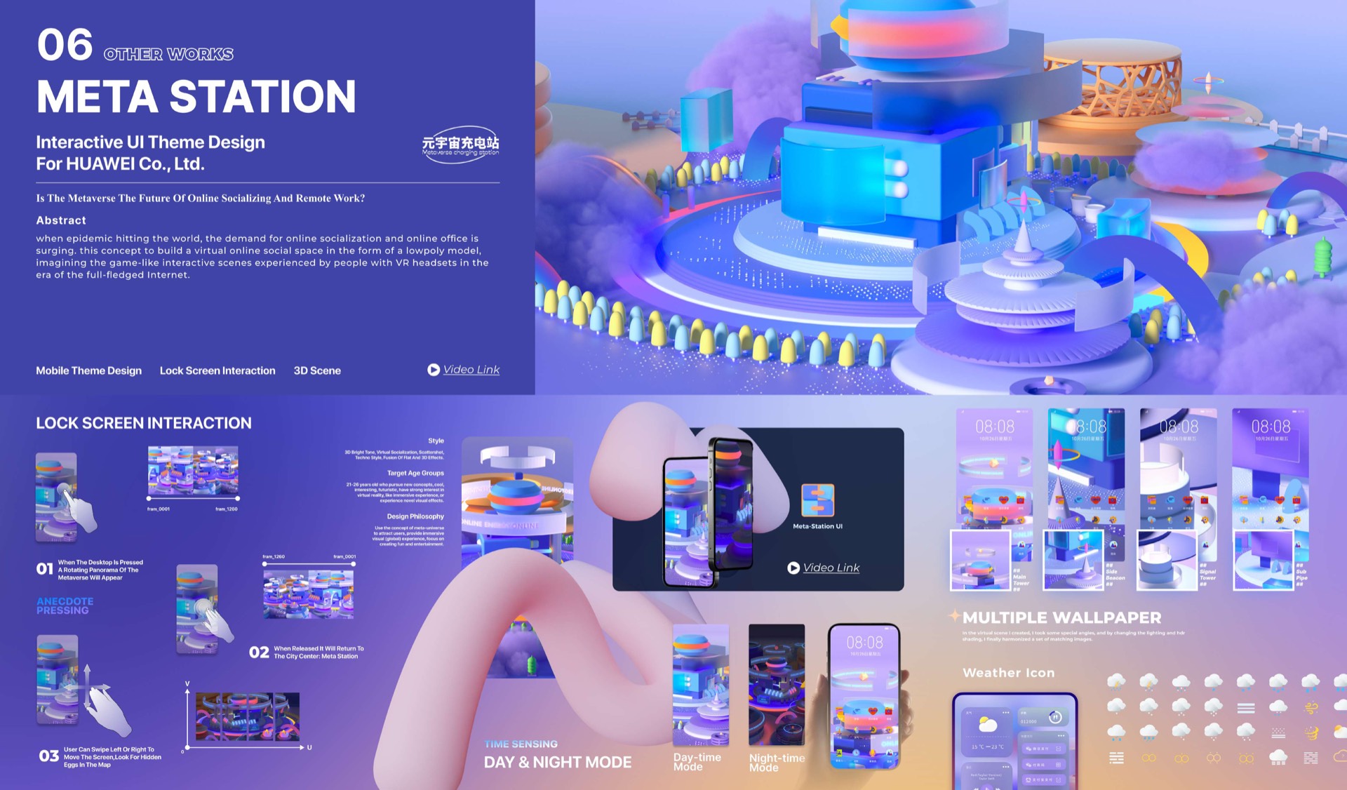
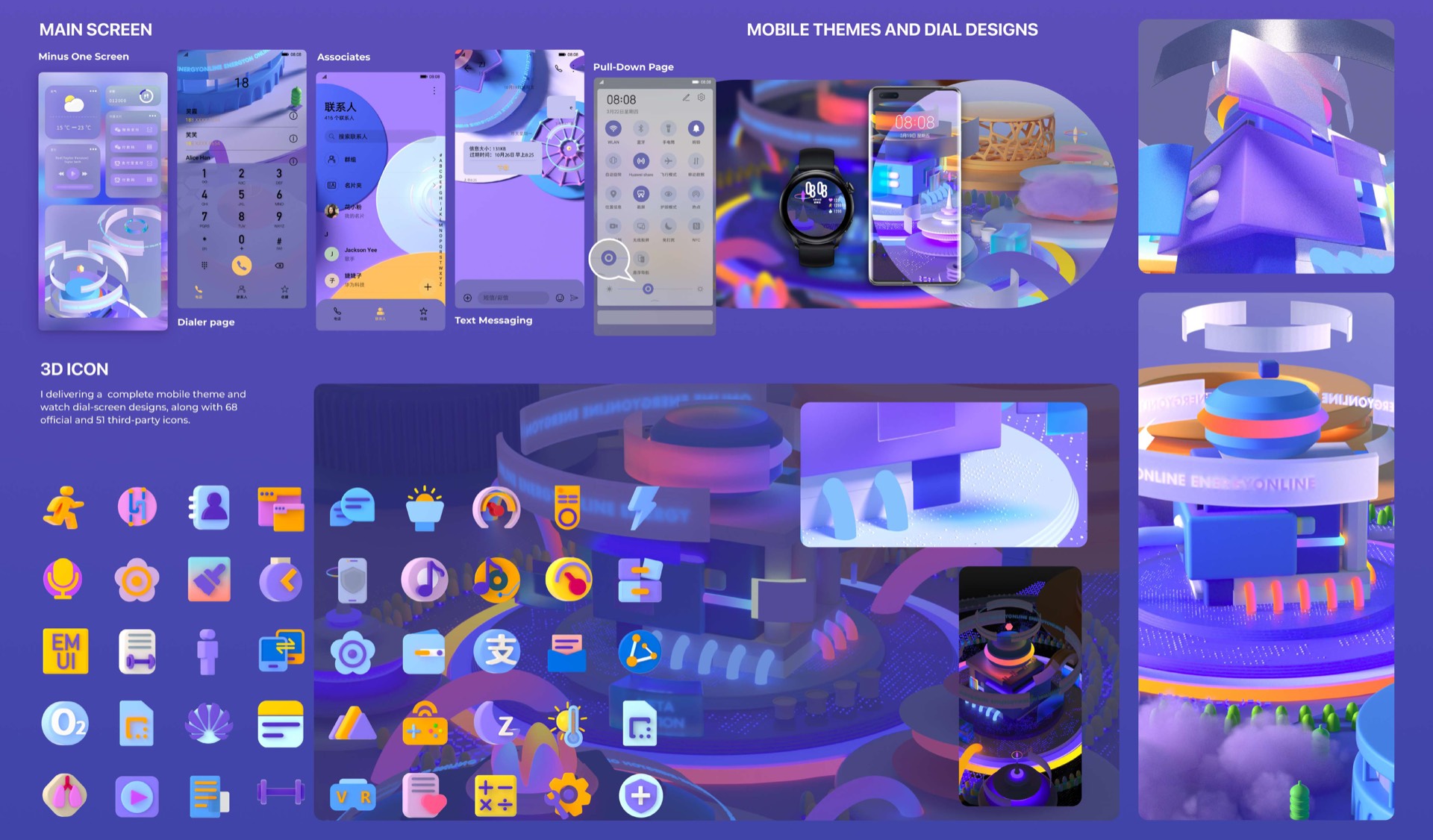
As UX Designer intern at HUAWEI in Chengdu (Sep to Dec 2022), I shipped two design systems for phone and watch faces on the Huawei Theme Store. Alongside that, I redesigned 68 first-party icons, adapted 51 third-party icons for HarmonyOS, and launched a new HarmonyOS interaction template. Meta Station is the flagship of the work. a HarmonyOS theme that treats the lock screen as a small social place rather than a utility tile.
Impact
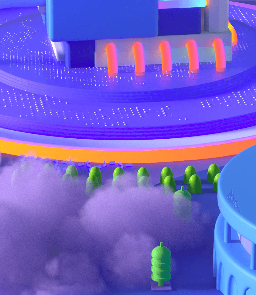
Shipped a HarmonyOS theme package that translated the virtual social space brief into a coherent phone surface: low-poly 3D world, day/night states, press-triggered scene motion, multi-wallpaper variants, and matching icon/weather language.
Role
Timeline
Team
The Challenge
During the pandemic, online work and social life became normal, but mobile lock screens still behaved like static skins: glanceable, decorative, and quickly dismissed. The original concept brief framed Meta Station around rising demand for online social spaces and the coming overlap between physical life and virtual worlds.
The design question became: how can a HarmonyOS theme make the phone's front door feel like a small virtual social space, without turning a lightweight lock screen into a heavy app?
Design logic
Questions & Key Decisions
How can day and night states communicate a system mood without adding interaction complexity?
01Key decisionBuild a world, not a wallpaperA static lockscreen image can be visually rich, but it does not make the phone feel responsive to time...
- Problem
- A static lockscreen image can be visually rich, but it does not make the phone feel responsive to time and context.
- Decision
- I designed Meta Station as a miniature spatial scene with day and night states.
- Why it worked
- A world model gives the interface a sense of continuity while staying lightweight enough for a phone surface.
- Outcome
- The concept feels more like an ambient system identity than a decorative background.
02Key decisionUse state change as the motion storyExtra interactions would make the lockscreen concept feel heavy and less platform-realistic.
- Problem
- Extra interactions would make the lockscreen concept feel heavy and less platform-realistic.
- Decision
- I focused the motion language on transitions between environmental states.
- Why it worked
- Time-based change is understandable, glanceable, and aligned with how people already read lockscreen context.
- Outcome
- The final card and motion assets communicate the concept quickly without needing a full app flow.
Research & Discovery
Style direction: 3D bright tone, virtual nostalgic, modernism, fashion style, future-of-the-past 80s to 90s. Target age groups: 21 to 35 year old hot-company employees and content seekers, the same fashion as the world.
Design philosophy borrowed from one internal note: 'Use the concept of meta-station to allow users to predict scenarios while navigating, creating fun in entertainment.'
Design Strategy
Three commitments shaped the work. The first was treating the lock screen as a front door rather than a doormat. somewhere the user could press to reveal a small anecdote, swipe sideways to look around the scene, and discover hidden eggs in the map. The second was making the scene aware of time. The same city shifts colour, light, and mood between morning and night, while keeping its characters and architecture intact, so it reads as one place living through a day rather than two unrelated palettes. The third was speaking a single visual language across every surface. City, desktop, weather widgets, and icons all sit inside the same lowpoly grammar so the theme feels like one inhabited world rather than a folder of loosely related assets.
Implementation & Pipeline
The work covered three connected pieces. authoring the 3D scene, designing the UI theme, and writing the lockscreen interaction logic. Out the other end came a meta-station city environment, multiple wallpaper variants, a day and night transition, and a weather-icon family that sits inside the same visual world as the rest of the theme.
The lockscreen interaction itself reads like a short sequence. When the desktop is pressed, a floating panorama of the meta-station appears. When released, the view returns to the city centre. Pressing reveals scene anecdotes, and the user can swipe left or right to move the camera and find hidden eggs in the map.
Results & Impact
A complete HUAWEI Theme product that ships as a single coherent world. It bundles the UI theme, the lockscreen interaction, the 3D scene, day and night mode, multiple wallpaper variants, and a matching weather-icon family. Released on HUAWEI Themes as Meta-Station UI.
Lessons Learned
Two ideas carry forward from this project. The first is that a theme is a tiny game world rather than a skin. Once the lockscreen has anecdotes, a swipeable point of view, and hidden details, it stops being decoration and becomes a place users return to between tasks. The second is that time itself can be a design surface. Day and night is not only a palette switch but an opportunity to give the theme a life cycle that maps to the rhythm of the user's day.
What's Next
Bring the same scene-as-place pattern into other small-screen surfaces. Apple Watch faces, in-flight entertainment lockscreens, smart-fridge ambient displays. Anywhere a screen sits in a person's life for hours but is treated as a static surface.
Continue exploring