How can a service-led studio site become an international-facing portfolio that is cinematic, categorized, and easy to scan?
Web Design, IA, Motion System
SKG+How can a local service-led studio site become an international immersive portfolio?
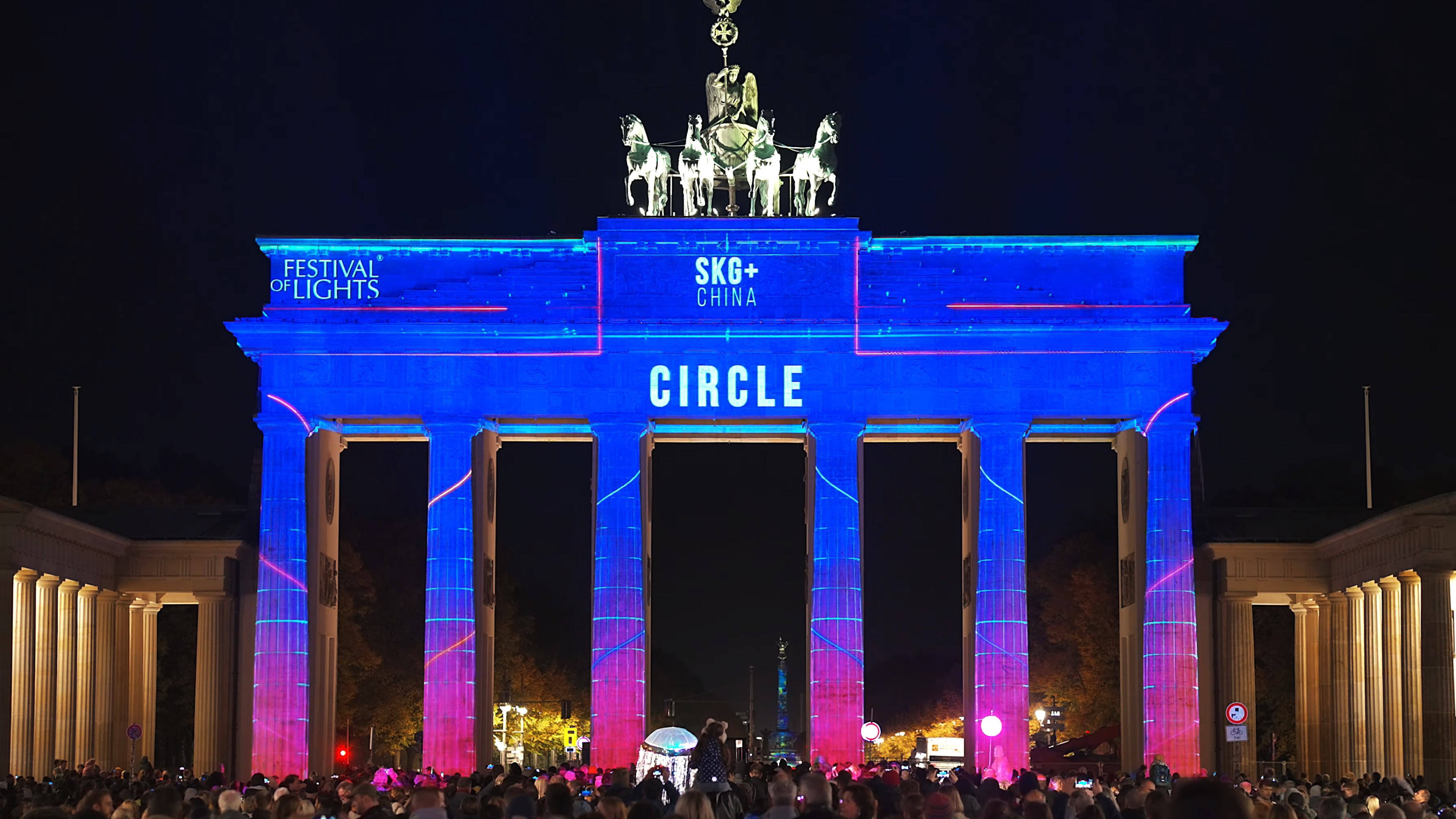
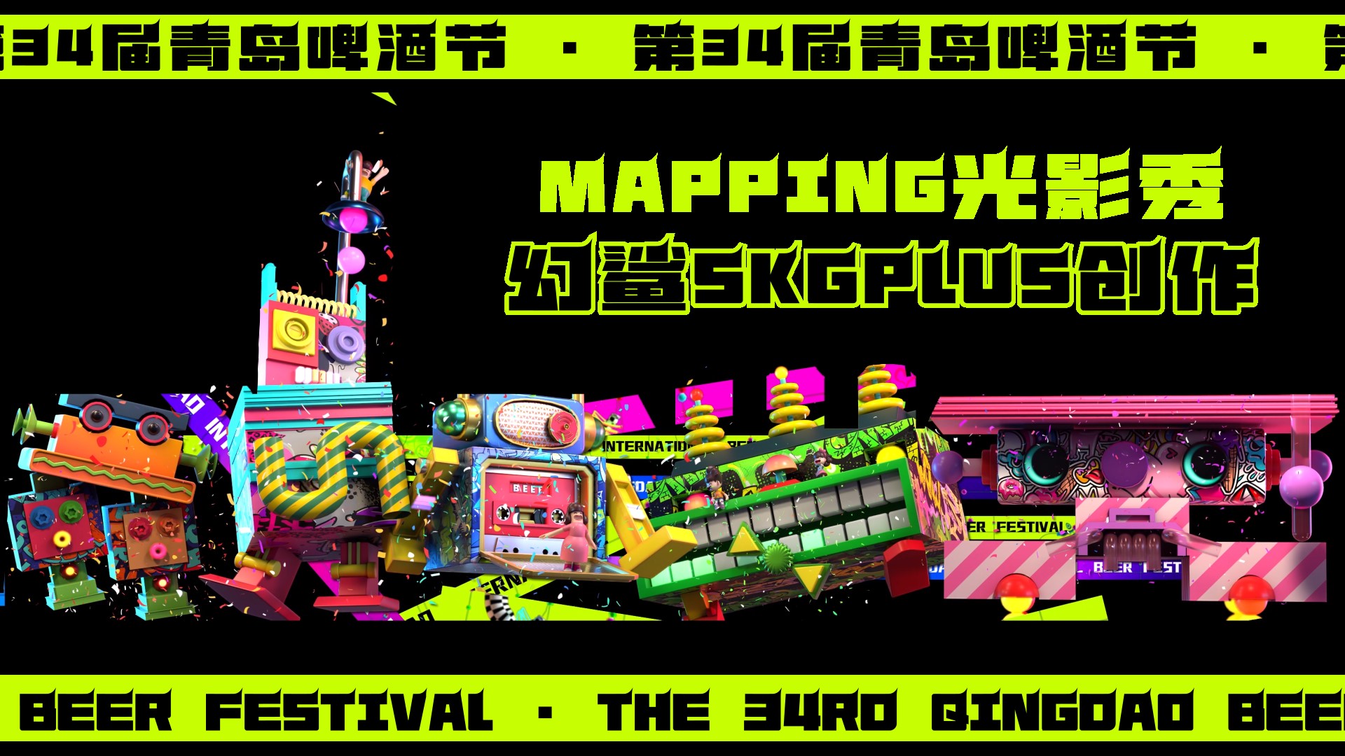
SKG+ is an immersive entertainment studio in mainland China. I joined as remote contract Web Designer and reshaped skgplus.cn from a service-led company site into a clearer portfolio system for mapping, exhibitions, cultural heritage, LED installations, and public show work.
Impact
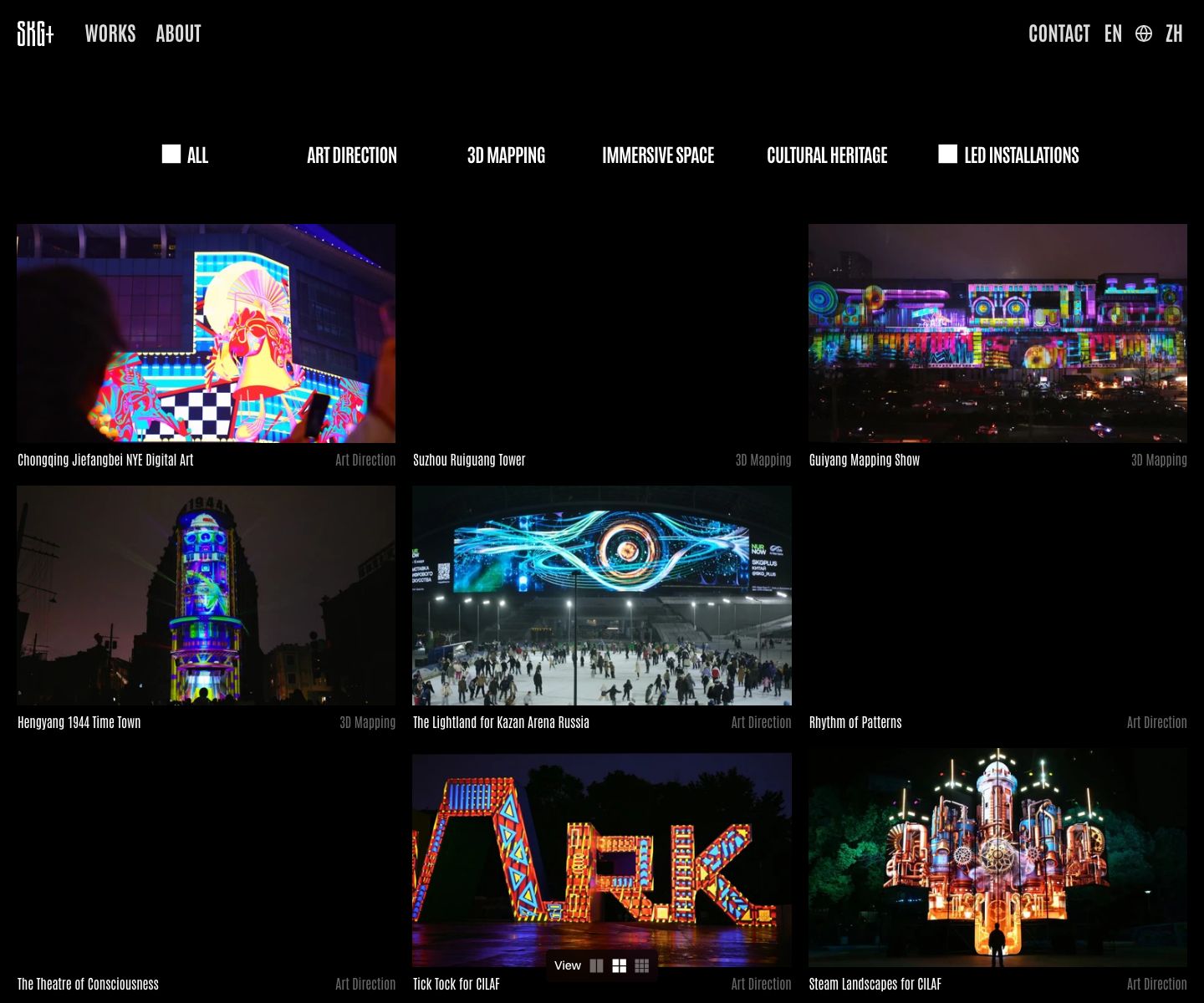
Reframed SKG+ from a service-led studio site into an international-facing immersive portfolio. The work turned a static services grid into a clearer taxonomy, restrained visual language, and motion-led archive for more than 170 works.
Role
Timeline
Team
The Challenge
SKG+ had a rich body of projection mapping, exhibitions, cultural heritage, LED, and show work, but the old site made visitors decode the studio through broad service labels and dense visual presentation.
The design problem was not to make the site louder. It was to make the studio easier to understand internationally while letting the work remain the spectacle.
Design logic
Questions & Key Decisions
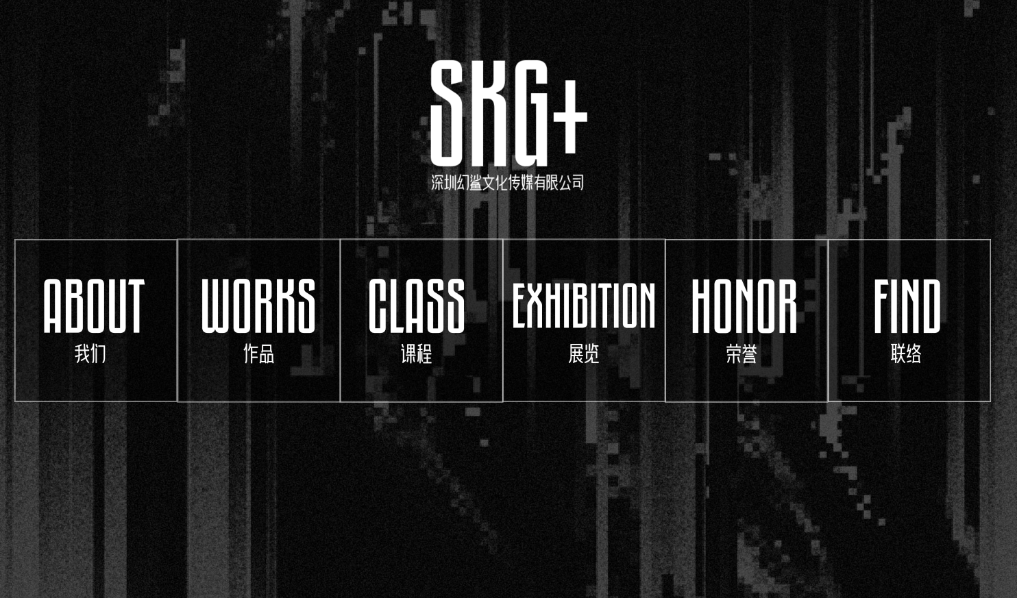
01Key decisionService tiles to portfolio taxonomyThe old site explained SKG+ through broad service doors, but visitors still had to decode what kind of...
- Problem
- The old site explained SKG+ through broad service doors, but visitors still had to decode what kind of creative work the studio actually made.
- Decision
- I rebuilt the archive around project categories such as mapping, exhibitions, cultural heritage, LED installations, and immersive spaces.
- Why it worked
- Category-first browsing lets international clients scan by experience type, scale, and atmosphere.
- Outcome
- the new archive foregrounds project categories and more than 170 works instead of asking visitors to start from generic service doors.
02Key decisionMotion as category languageStatic JPG explanations could not express the timing and scale of projection mapping, LED work, or...
- Problem
- Static JPG explanations could not express the timing and scale of projection mapping, LED work, or exhibition systems.
- Decision
- I paired a restrained international frame with compact icons, hover states, and showreel-like motion cues.
- Why it worked
- The quiet frame lets the media carry the spectacle while motion explains the temporal nature of the work.
- Outcome
- restrained framing, compact icons, hover states, and showreel cues let the project media carry spectacle while visitors keep orientation.
Research & Discovery
I mapped the content operation with the founder and internal content team, then audited how the archive needed to support media-heavy projects, frequent updates, and different client audiences.
The hypothesis was that a quieter frame and category-first structure would improve scanning more than another immersive visual layer. The site's job became selection and orientation, not decoration.
Design Strategy
I organized the archive around project categories and reusable content patterns. Mapping, exhibitions, cultural heritage, LED work, and immersive spaces became browsing logic rather than background copy.
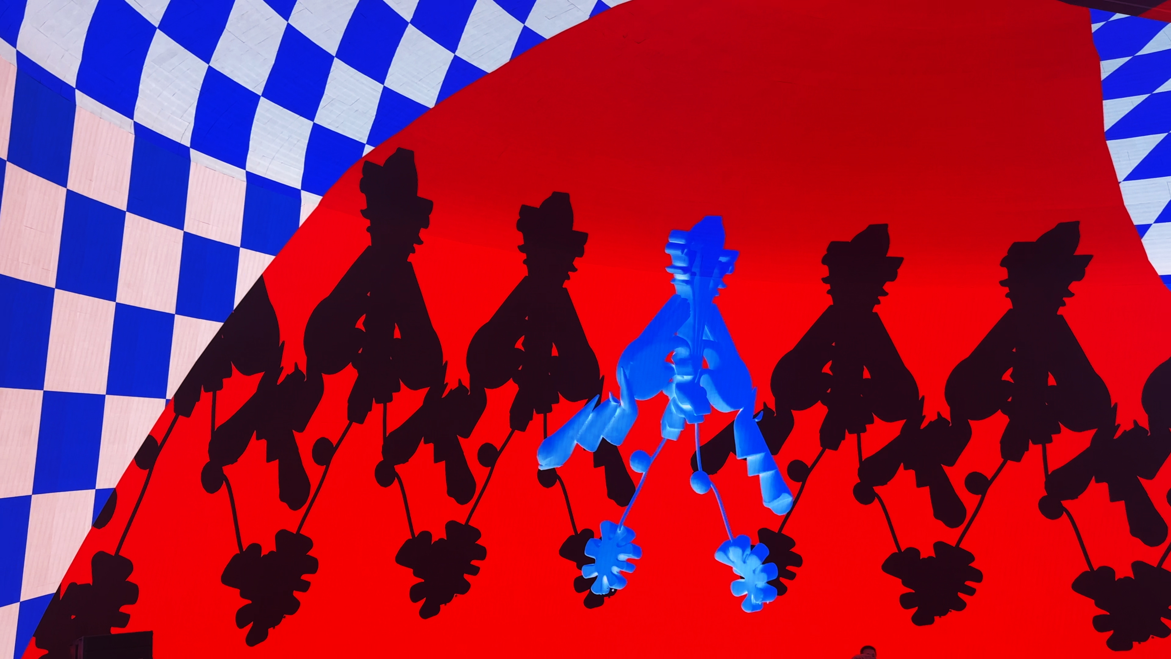
The visual system stayed restrained because SKG+'s project media is already high-saturation and motion-heavy. The interface should create rhythm, hierarchy, and trust.
Implementation & Pipeline
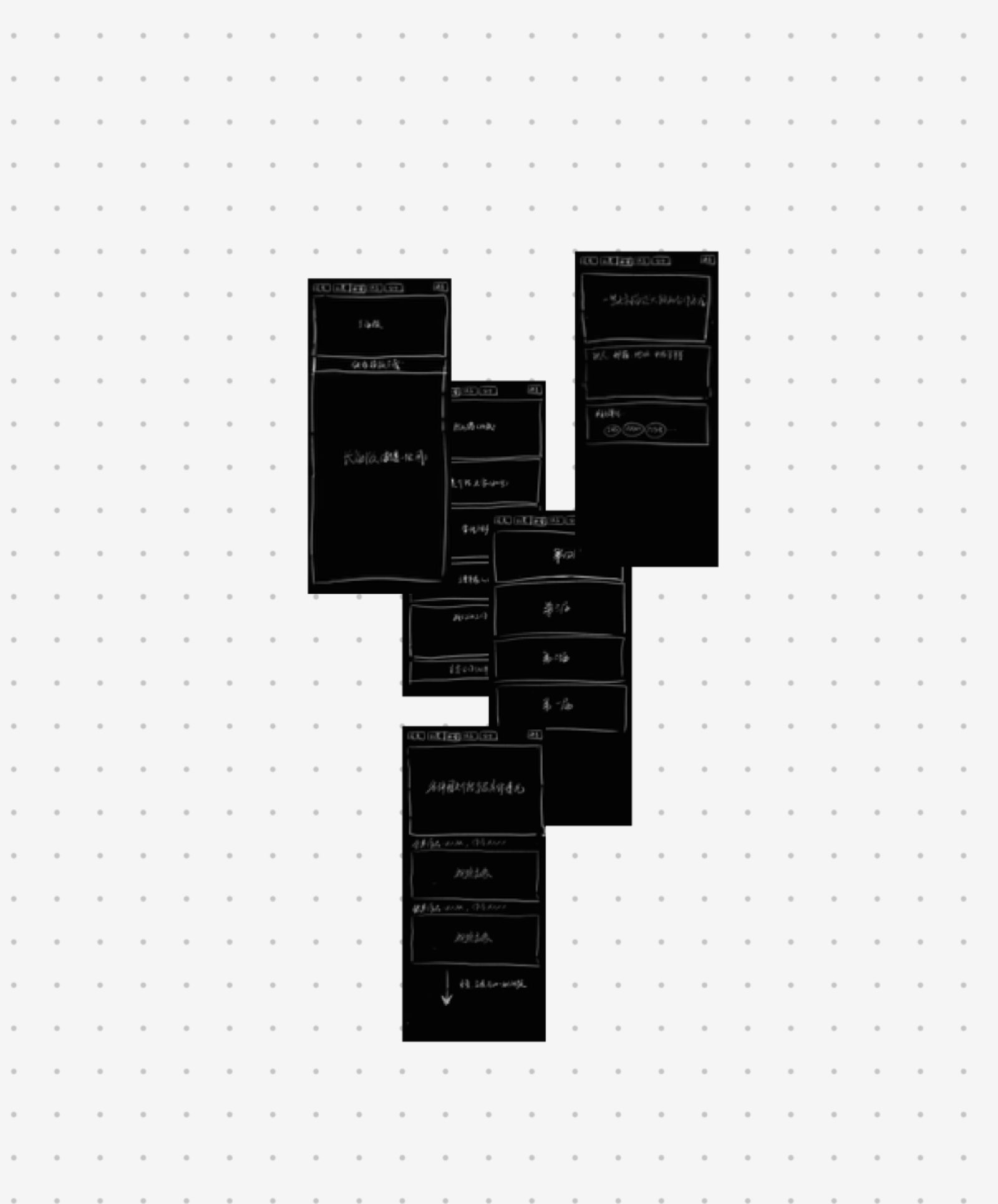
I designed the site information architecture, category logic, visual direction, motion cues, and maintainable publishing workflow. The same system then helped the team ship a related mapping contest site under a compressed timeline.
The key implementation decision was to treat content operations as part of UX: project data, media hosting, filtering, and responsive presentation all had to work for maintainers, not only visitors.
Results & Impact
The public evidence is a shipped client website, a scalable archive for more than 170 works, and an adjacent competition site launched quickly from the same system logic. The case shows client delivery, IA, motion direction, and maintainable web design under real constraints.
Lessons Learned
A client site can fail even when it looks impressive if the team cannot maintain it. The strongest design decision was reducing visual noise so the work, taxonomy, and publishing workflow could carry the experience.
What's Next
The next useful improvement is stronger public documentation of the publishing workflow, with a clean pipeline diagram and fresh live-site screenshots for desktop and mobile.
Continue exploring